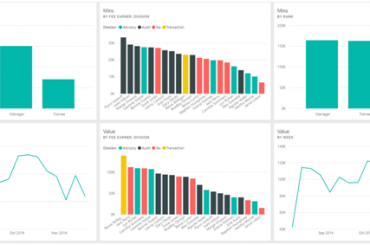
Dashboards are a popular, effective tool for managers and other business people to better understand their companies through data analytics. In recent years, the development and the growing popularity of visualization tools like Tableau and Power BI has facilitated the expansion of business dashboards.
The goal of a dashboard it to generate better business insights for organizations. Sadly, the increasing quantity of dashboards in the business world has not been accompanied by an increase in quality. While it may seem easy to create a dashboard, designing an effective dashboard takes careful consideration. It’s easy get so absorbed in fancy graphics without noticing that your dashboard is not effectively communicating its message to readers.
Over a series of posts on this topic, we’ll discuss some of the principles behind designing effective dashboards. We’ll see how to select charts for a dashboard, how to lay out the dashboard, and a set of design tips that will convert your dashboards from a collection of pretty pictures into a collection of impactful insights into your business.
What is a Dashboard?
Before we start discussing design principles though, let’s get a clear definition of what a dashboard is. A dashboard is an easy-to-read single screen interface that shows the Key Performance Indicators, or KPIs, for a business unit.
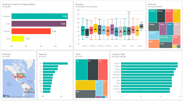
What this means is that a dashboard is a collection of charts, tables and other visualizations that can be used by managers or others to quickly gauge the company’s performance. The charts are generated through analyzing the company’s data, and are arranged into a dashboard to provide at-a-glance insights into the company’s performance.
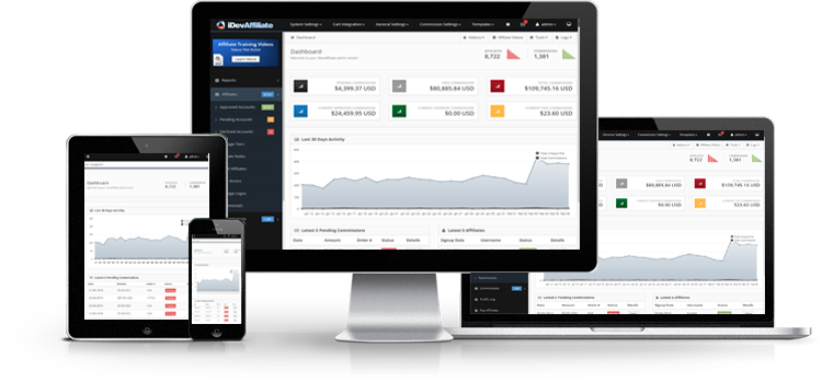
Below is an example of a business dashboard. You can see there are several different charts showing various different things about the business. Each chart should have a key message that can be identified at a glance.
What You Need to Consider
The effectiveness of a dashboard can be impacted by decisions made before any charts are first created. For the rest of this post, we’ll consider a few factors that should be considered before any dashboards are created.
Target Audience
Before creating a dashboard, its purpose should be clearly defined. One of the most important steps in doing this is clearly identifying a target audience. This audience should usually be a single person or a single group of people. The dashboard should also focus on a single area of the business. A dashboard covering a broad area of the business or targeting too broad an audience, will generally be more vague and consequently less impactful.
In this case, the dashboard will be targeted at the company’s executives. This is a clear and well-defined group of people. The topic of the dashboard will be the performance of fee earners over a period of several months.
Relevant Information
Once the target audience has been identified, you should clearly identify the information that the audience needs from the dashboard. This does not mean that you should specify the exact details of every chart that will go on the dashboard, but you should know what the main objectives of the dashboard are. It’s generally best to avoid vague objectives such as “Find something interesting in this dataset”. While modern BI software does make exploratory data analysis quite easy, this exploration should occur well before dashboards are being considered.
Here we have identified that our dashboard will analyze performance of fee earners, however we should get more details on that before starting. Our executives tell us that they want to know which fee earners have generated the most value over the period covered by the dataset. They also want to be able to compare the performance of fee earners by rank and by division. This information helps us create a much more effective dashboard.
Dashboard Consumption
A final factor to be considered is how the dashboard will be displayed. One of the key principles of a dashboard is that it should be a single-screen interface, meaning that a viewer should not need to scroll through it to see all the charts. As a result, it’s important to know what kind of screen a dashboard will be viewed on before creating it.
Having too many charts could require the user to scroll or could make each chart too small to view the details at a glance. Having too few charts could mean that the space on the dashboard is not used effectively.
In this case, the dashboard will be presented to the executives at a meeting where the dashboard will be projected onto a large screen. As a result, the dashboard can afford to be relatively large without compromising the user experience.
Conclusion
In this post, we have discussed the importance of dashboards to modern businesses and explained the things to consider before creating a dashboard.
Over the remaining posts in this series, we’ll look at other factors that influence the impact of a dashboard on its readers. In the next post, where we’ll learn about the importance of choosing the right chart for a given situation.

